When I was living at home (like, a month ago) I threw out a block of cheese. I have no self-restraint when it comes to cheese so I just had to throw it into the rubbish bin and hope it made its way to those starving kids in Africa. Mum was mad that I had thrown out a seven dollar block of cheese. I was just relieved to be released from the power it had over me. Then she bought another block. Maybe if I eat heaps of cheese I will develop an allergy so severe that it will poison me if I try to eat it? That seems to be my best option for getting over this cheese addiction.
And then I came to London and cheese here is less than two pounds pounds, even the fancy stuff, like feta.
Wednesday, September 5, 2012

Wednesday, August 15, 2012
The Talented Mr. Ripley

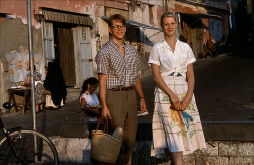

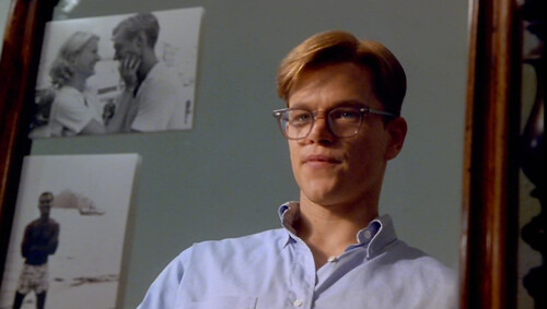
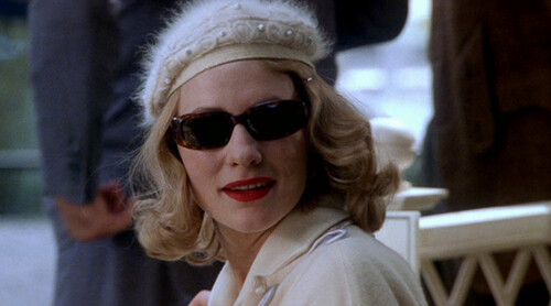
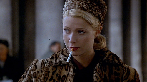

I recently rented a bunch of movies in preparation for my upcoming European exploration. I chose Roman Holiday, Midnight in Paris, Stealing Beauty, Before Sunrise, Paris Je'Taime and The Talented Mr. Ripley. Each film was selected for its realistic portrayal of what life in Europe is actually like. A girl's gotta be prepared, amirite??
The cinematic style in The Talented Mr. Ripley is an aesthetic I often find myself coming back to. There's nothing fussy or brash about it, its impact is all in the details instead. It's those crisp shirts, tied at the waist (hers), or with the top button undone (his). It's the tortoiseshell accents, sweeping hair back and framing the eyes. It's Cate Blanchett and her scarlet pout.
It's Italy.
Monday, August 13, 2012
Why the September Issue is so important.
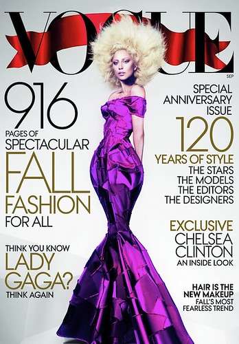
Lady Gaga on the cover of the September 2012 issue of Vogue
This year's September issue of US Vogue is their biggest yet at 916 pages. Which is great for them, because it means they got lots of advertising revenue this month, and will keep their position of influence at the top of the fashion pyramid (at this stage, the majority of bloggers feature somewhere down the bottom) for a little bit longer.
In magazine publishing, the September issue is the most important, with the most lavish fashion shoots and the most ads. This idea was cemented in popular culture with the release of the documentary The September Issue, which looks at the process of putting together (what was at the time) Vogue's biggest ever issue. But what is it about September that makes it so special? Why not spread out some of that creativity and advertising dollars throughout the rest of the year?
I came across this quote while reading Fashioning Teenagers: A Cultural History of Seventeen Magazine by Kelly Massoni. It's a great read for those interested in magazine publishing in the 20th century, how a magazine works and the rise of the female voice in the media.
"We hope most of you had fun with our 'summer fun' issue. Perhaps we should explain how the fashion business works. The July issue of any magazine is low in fashion pages, simply because there are very few clothes made to sell in July. The manufacturers are busy working on their fall lines; stores push 'sale' merchandise in July. But, as you can see from our August and September issues, we've rounded up big back-to-school fashion wardrobes for you." - Helen Valentine's Editor's Letter in the August 1950 issue of Seventeen.So the September issue is important because it signals a fresh start with the school and university year starting in September in the US. The idea of having the major sales over summer and releasing the big collections in autumn seems totally outdated now, what with sales happening year-round post-recession and labels releasing up to eight different collections a year. But the publishing industry, like the music industry, is pretty set in its old ways and is often slow to adjust with the changing marketplace.
On a semi-related note, this article, published in the New York Times is an interesting look at the sharp decline in readership numbers and how magazines are trying to win them back. I hope you've got a NYT subscription, it's totally worth it!
Wednesday, August 8, 2012
London!


Lindsey Wixon shot by Terry Richardson and styled by Francesca Burns for the August 2012 issue of British Vogue.
I am heading to London in two weeks, to frolic through the autumnal leaves of Hyde Park while wearing a hat perched at a jaunty angle and a tweed suit. God I love jaunty angles.
Monday, August 6, 2012
I just heard the new Presets single 'Ghosts' and I had a terrible thought that I am nervous about blogging out loud lest it come true.
But there's something about the commercial, anthemic arrangement (yes the Presets are already commercially successful and make anthemic tunes, and this one is like that but in a different, more Coldplay-esque way) that makes me wonder if their soon-to-be-released new album will be their Because of the Times?
I know. I'm sorry Presets, I love you (now and forever) but I just couldn't keep my premature opinion to myself with this one.
But there's something about the commercial, anthemic arrangement (yes the Presets are already commercially successful and make anthemic tunes, and this one is like that but in a different, more Coldplay-esque way) that makes me wonder if their soon-to-be-released new album will be their Because of the Times?
I know. I'm sorry Presets, I love you (now and forever) but I just couldn't keep my premature opinion to myself with this one.
Friday, August 3, 2012
On the history of the word 'Chic'

This camel, as seen on New Zealand's Next Top Model is definitely chic.
Two years ago, says Heather Wagner, copy director at Elle, "we even had a meeting about it. It was on every other page. It was back when Carol Smith was our publisher; she actually noticed it and said there's a moratorium on the word 'chic.'" Some arbiters are recommending restraint. "I don't throw that word around lightly," Tommy Ton tells me. And what the repercussions of constant usage are remains unclear. "Is this going to be a dated word?" Emily Weiss wonders when I phone her to ask about for-lack-of-a-better-word chic. "Is this going to be like 'groovy'?"Style.com writer Matthew Schneier has written an interesting piece about the use of the word chic, and how it came to be fashion. For all my fellow fashion and linguistics geeks out there.
Thursday, August 2, 2012
For the love of Jimmy D

Photo by Always Sometimes Anytime.
From Jimmy D's S/S '13 Rising Sun Melting Moon collection.
Oh my gosh I want some of those donut earrings!
James Dobson is one of my favourite New Zealand designers. With each new collection, created under the label Jimmy D, I am overcome with a desire to high-five the designer for just nailing it.
It has been thrilling to watch Dobson's designs grow in confidence over the past five years especially. Between seasons, the Jimmy D aesthetic is consistent, but his sources of inspiration are erratic, keeping the designs fresh and modern.
I love how, despite the obvious darkness of the label, there is always a sense of playfulness there that is more subtle and intelligent than just using a fun print (though I do love me some fun prints).
Working in fashion retail, it's a brilliant moment when you see a customer jolt with pleasant surprise upon discovering how much better and different a garment looks on the body than it does on the rack. Jimmy D pieces are always best tried on to see the full beauty of them. This way, it's almost as if Dobson is rewarding those who are willing to seek new styles out.
Julie Roulston over at Fashionz spoke to Dobson recently about his career progression and his Spring/Summer '13 collection. It's a great read, you can see it here.
Subscribe to:
Posts (Atom)